Summary
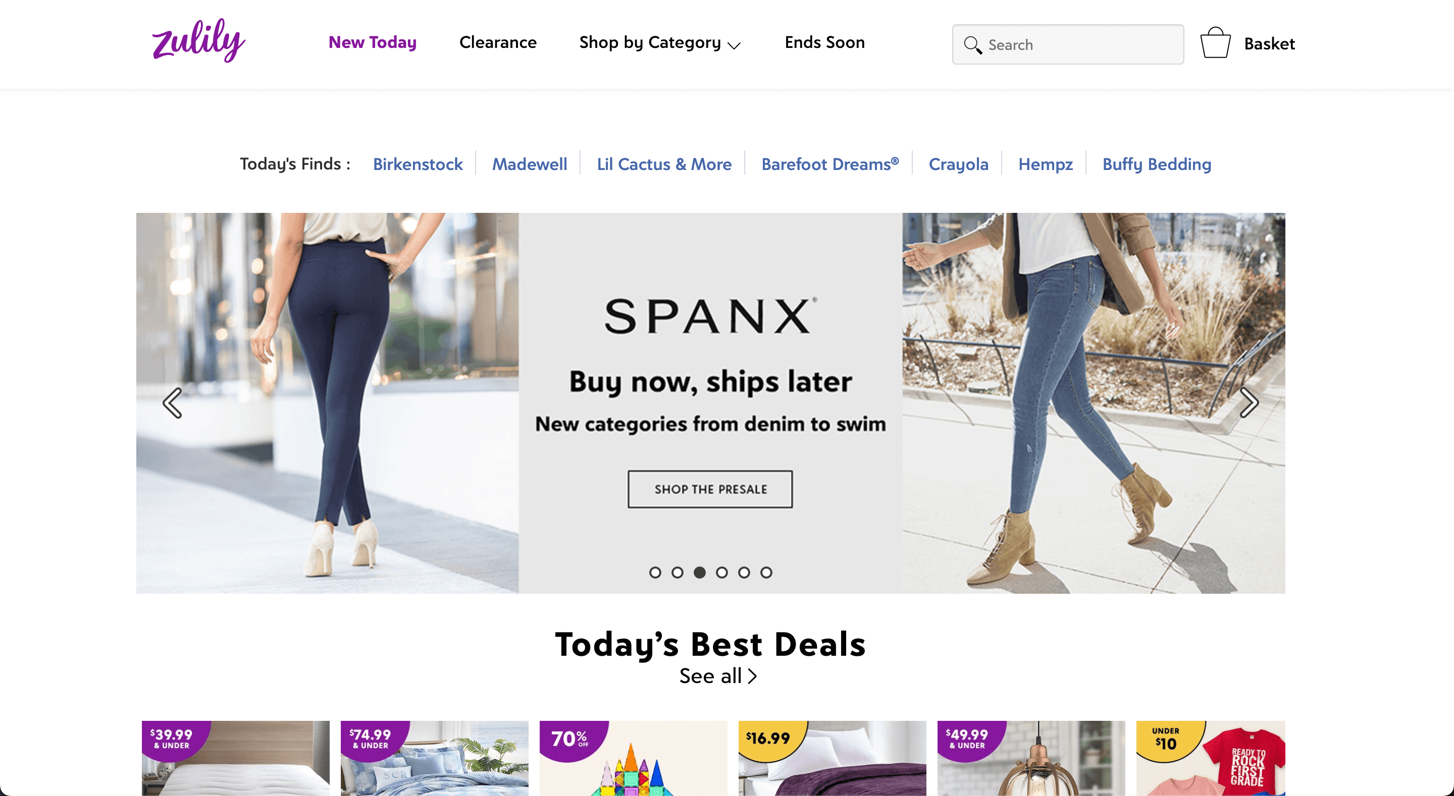
Zulily is an e-commerce platform, targeted at moms, where vendors sell their merchandise at reduced prices as part of sales events. Historically, the company only offered flash-sales with temporary merchandise. As part of a broader push to maintain growth, Zulily needed to offer permanent merchandise alongside flash-sales items. This project details how we made that vision possible in a 3-day sprint, increasing merchant revenue by $50MM anually.
MY ROLE
UI/UX Design, Prototyping, User Research
CROSS FUNCTIONAL PARTNERS
1 Product Manager, 4 Engineers

Project Background
During a challenging company contraction, the CEO asked my team to create a new way to display merchandise across Zulily. We needed to present permanent inventory alongside flash-sales products, while also taking into account a handful of other product states. We had less than one week to present this vision, so I broke the project into a 3-day sprint:
Day 1: Comparative analysis of other e-commerce platforms and evaluation of Zulily product tiles
Day 2: Product tile redesign
Day 3: Prototyping, user testing, and implementing final feedback
Day 1: Comparative Analysis
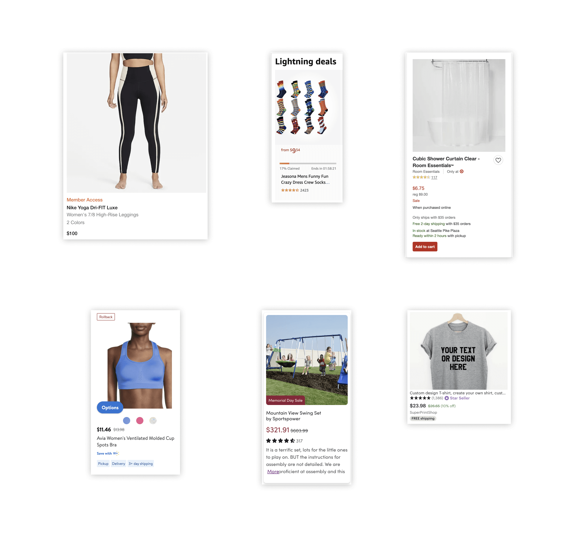
I compiled product tiles from various e-commerce platforms and analyzed their information hierarchy, layout choices, and use of color to create a loose set of best practices we could use to guide our explorations. Some of those best practices included:
- A basic product tile to use as a foundation
- A minimal use of color
- Tags to display special states like an item being on-sale or shipping quickly

Day 2: Zulily Product Tile Evaluation
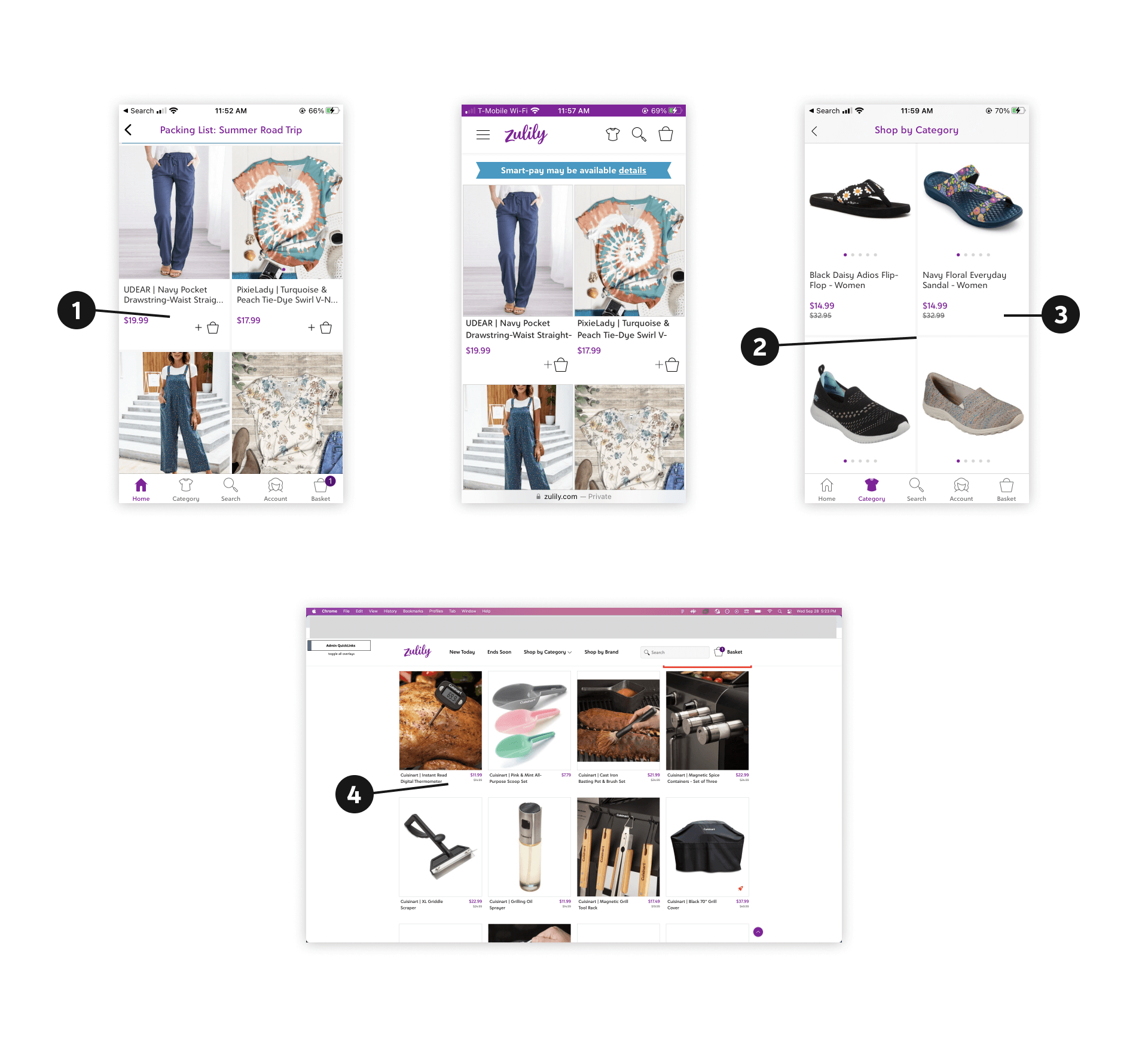
Comparing the modern product tiles to Zulily's gave us a ton of ideas to explore. Some of the things we needed to improve included:
- Tile info lacking hierarchy, impacting readability if new info is added.
- Large dividers that create a pseudo-card design, taking away screen space.
- Inconsistencies like quick-add to basket appearing/disappearing.
- On web, a side-by-side layout that will be unreadable if tags come into play.

Day 2 Con't: iOS Redesign
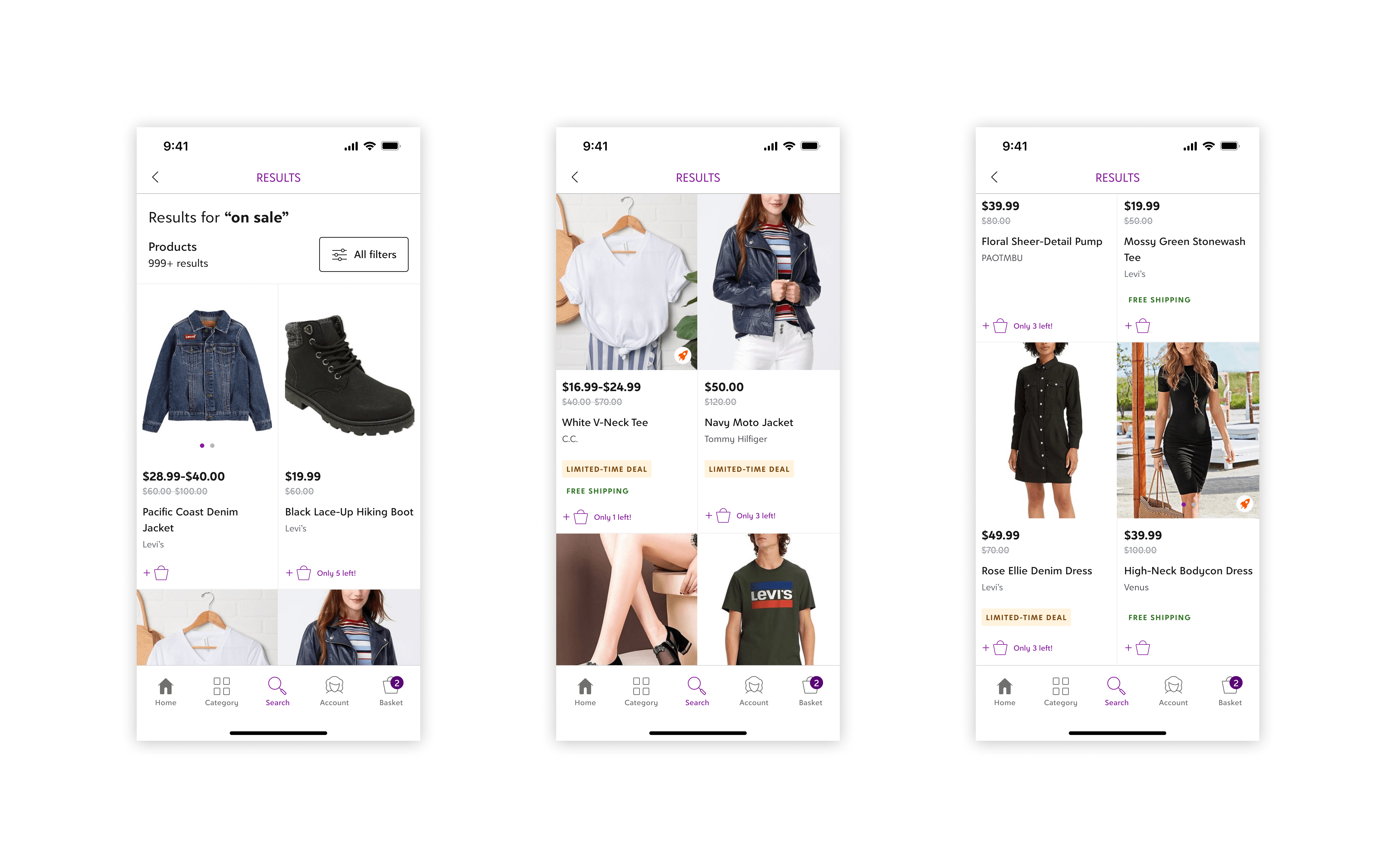
Wireframing/low-fi explorations usually come next, but with the extreme time constraints and the fact that we're primarily designing for high density content, I went into high fidelity to get the job done. Beginning with iOS, I created full-width product tiles emphasizing the following changes:
- Left aligned content for readability
- Bold pricing and text to help customers scan items
- Relegating purple to signal actionability
- Creating a system of all-caps, colored tags to show special product qualities
- And rules to match tile height despite differences in tile content, creating an aesthetic browsing experience

Day 3: Prototyping and User Testing
After getting feedback from the team, we needed some external validation to feel confident about developing the new tiles. I created a quick user test and recruited 15 users to validate the following:
- Can customers identify products?
- Do they know the price of each product and if they do, do they notice the price reduction?
- Do they notice anything about products?
- If they noticed the tags, can they explain what they mean?
Every customer was able to complete the tasks, giving us the validation we needed, while also providing us with feedback for later followups. You can view a copy of the prototype tested with customers below.
Cross-Platform Final Designs
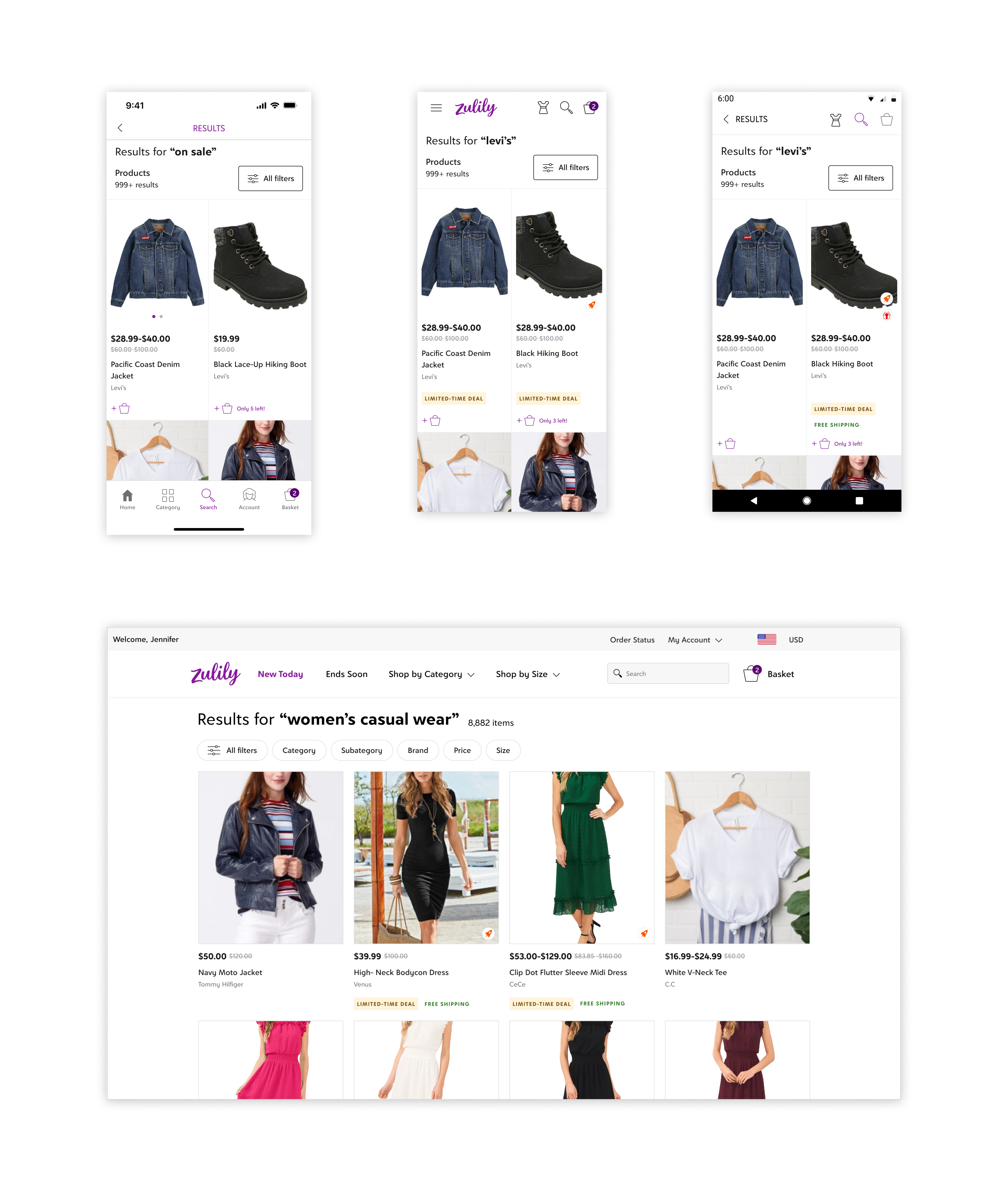
I translated the iOS designs to Android and responsive web, creating a universal product tile that standardized how products were shown on Zulily across device experiences. The leadership team gave us the green light and I worked with engineers over the next two months to develop the new tiles.

The Results
The hard work we put it in produced dramatic results. We helped Zulily merchants generate $50MM in revenue annually, paving the way for an entirely new business model.
