Summary
Open Measures is an open-source threat intelligence company that helps journalists, researchers, and social enterprises investigate harmful online activity such as extremism and disinformation. I led our team in building a graph interface on top of our API to help our customers see how user activity relates across every corner of the unmoderated internet, increasing ARR by 200K and extending our runway by 1 year.
MY ROLE
UI/UX Design, Visual Design, User Research, Product Management
CROSS FUNCTIONAL PARTNERS
2 Backend Engineers, 2 Front-end Engineers

The Problem
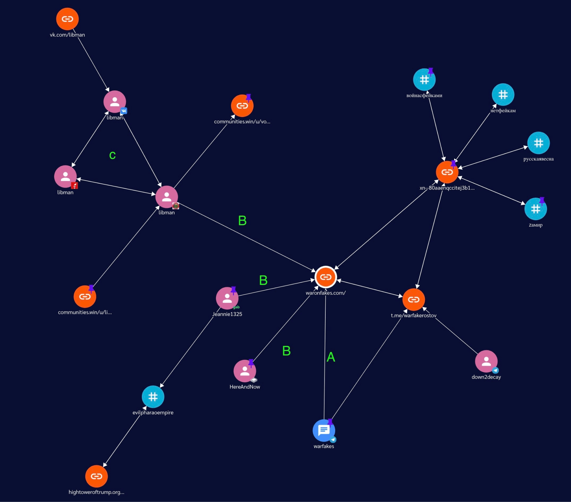
Threat researchers examine network effects and often build deliverables that show a visual representation of the people and topics they investigate. Our company was only capable of providing data collection solutions through our API. This forced our customers to map data manually or use competing offerings for parts of their workflow. Additionally, prospective customers were reluctant to sign contracts with us knowing we could not provide a complete solution for their needs.
Building our own network graph would give us the chance to improve existing customer workflows and expand our business during a critical period of our growth.

Research
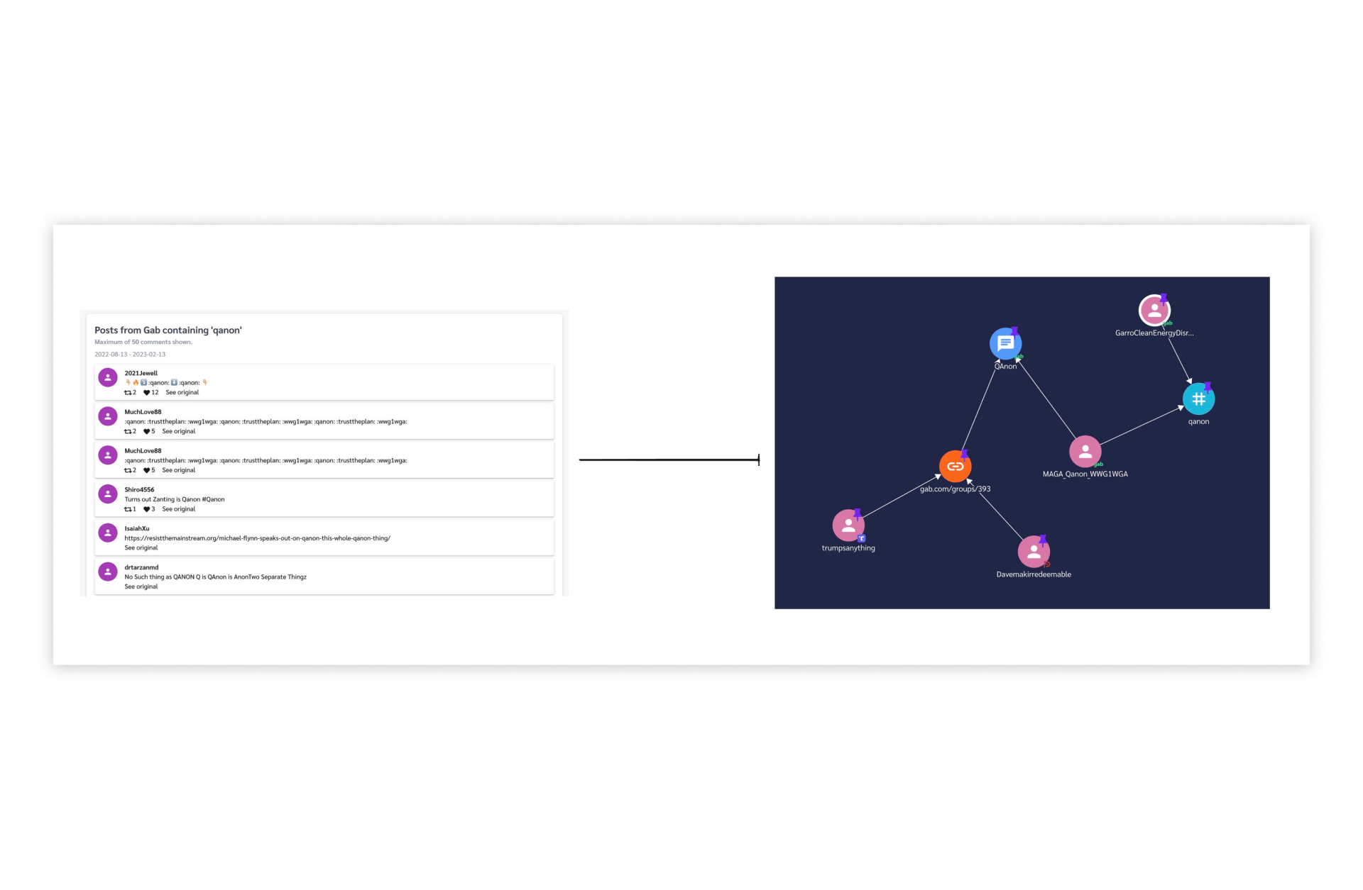
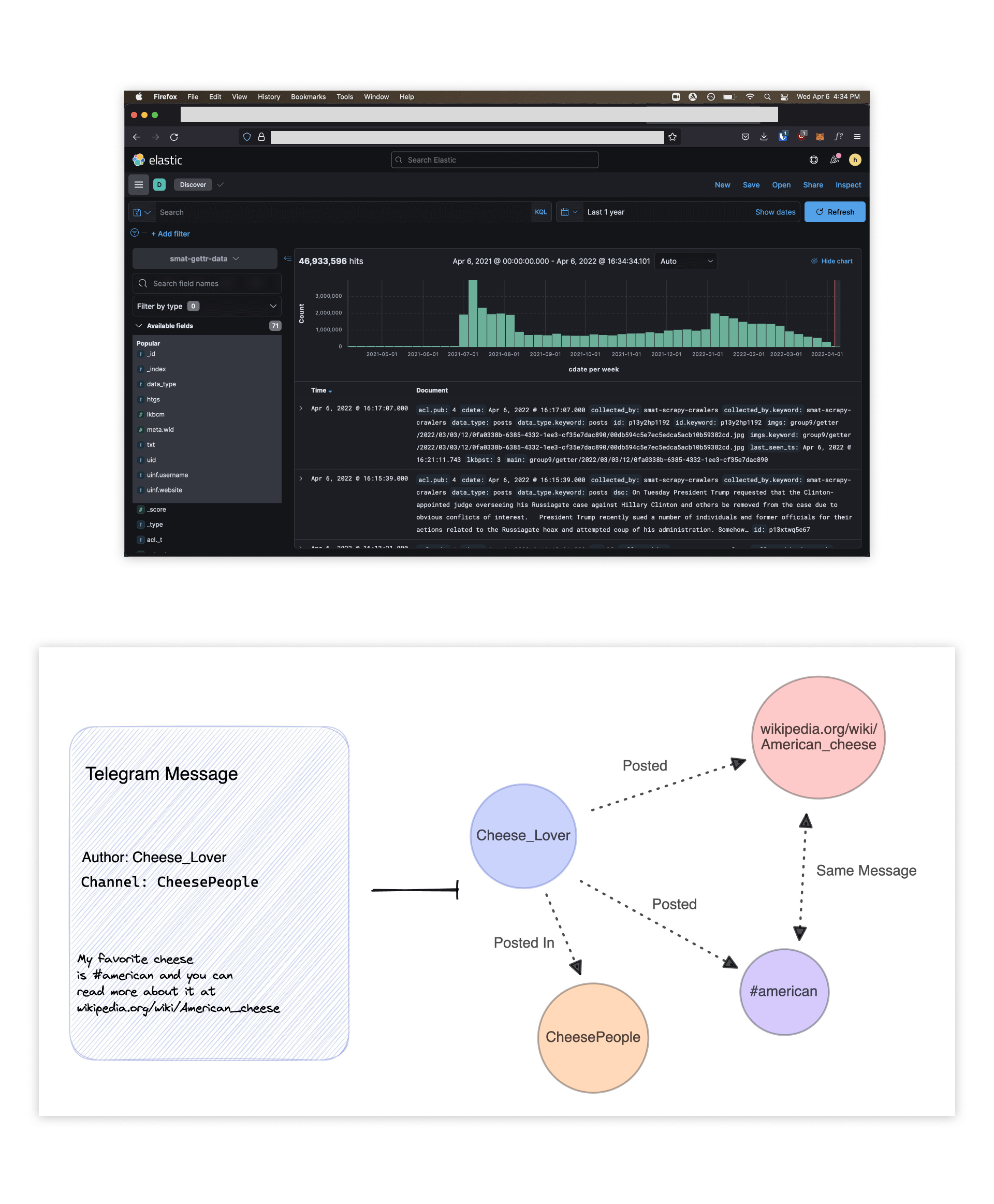
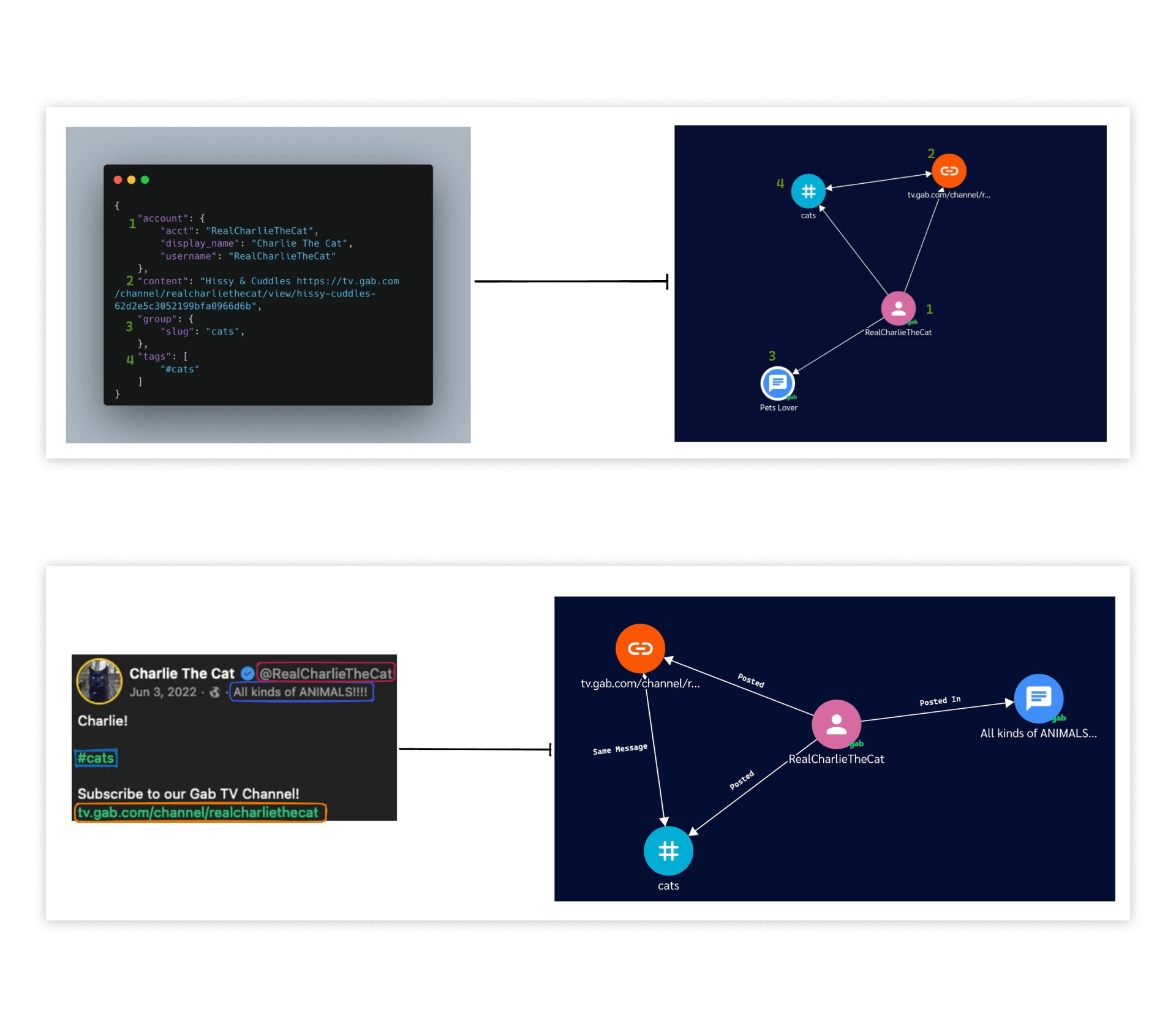
In the research phase, we scoured through our 20+ data sources and created a standardized list of data fields. Using those data fields, we created what would become each node type that could appear on the graph: users, links, hashtags, or channels.
In the screenshots below you can see what our raw data looked like in elasticsearch, followed by a drawing of our node creation process.

Inspiration Gathering
The next step of the process was to find visual inspiration for our network graph. Most network graphs are clunky and overwhelming, and I wanted to chart a different path with ours.
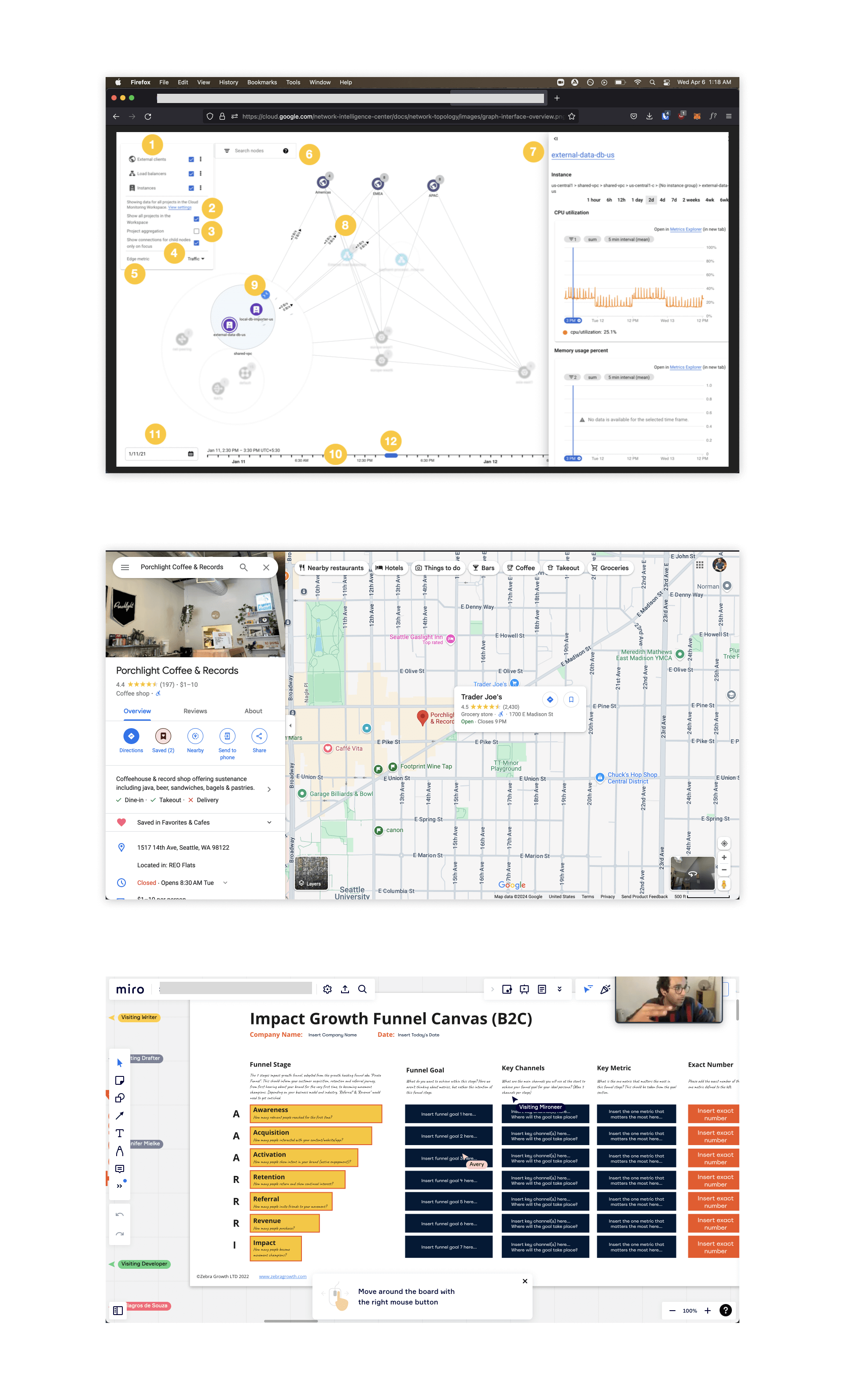
I looked at some similar tools but also looked outside of the space, to Google Maps and Miro as examples. Both of these tools are visual interfaces that give users ways of manipulating elements they see, while also helping them digestive loads of information. I wanted to bring that level of intuition and beauty to the dense space of threat intelligence.

Wireframes
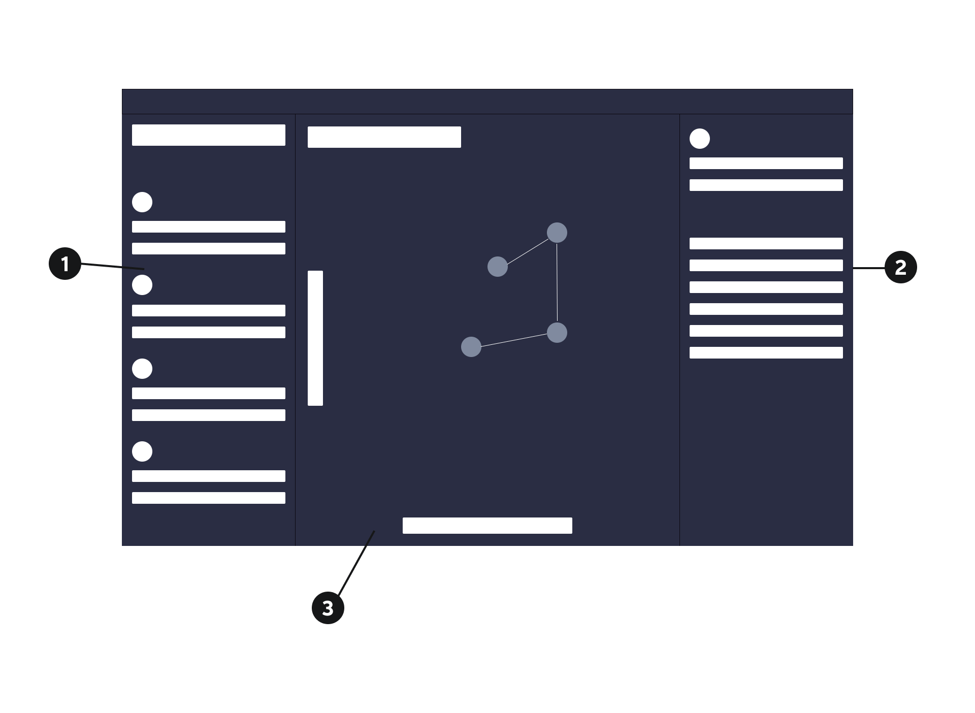
In the wireframe stage, I broke down the design into three separate phases:
- How to search for nodes and add them to the graph
- How to discover more about existing nodes and their relations to the rest of the graph
- And lastly, how to maneuver around the graph and manipulate its elements
I opted for this order because graph manipulation is entirely visual design/prototyping. It will take multiple rounds of lo-fi engineering to nail, and is actually useless if a user doesn't know what they are interacting with.

Search Panel
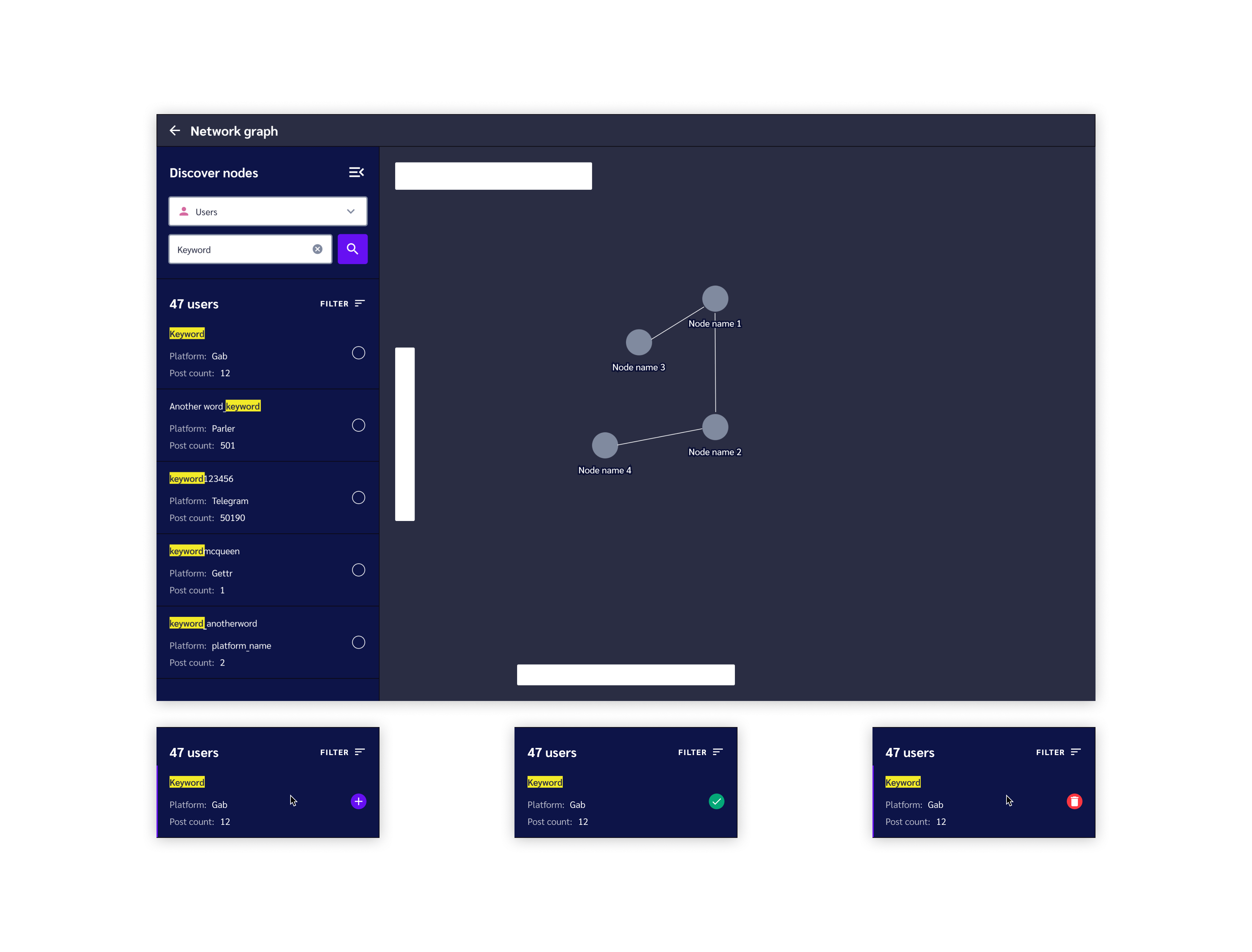
Looking to the contextual panels of Google Maps for inspiration, I designed a collapsable left panel for searching across node types, learning relevant information about them, and adding them to the graph.
Each search tile contains a highlighted keyword for scannability, information about the platform/data source its coming from, and how much reach it has. Contextual hover actions save visual space while communicating to users what actions can be taken upon each search result.

Node Details Panel
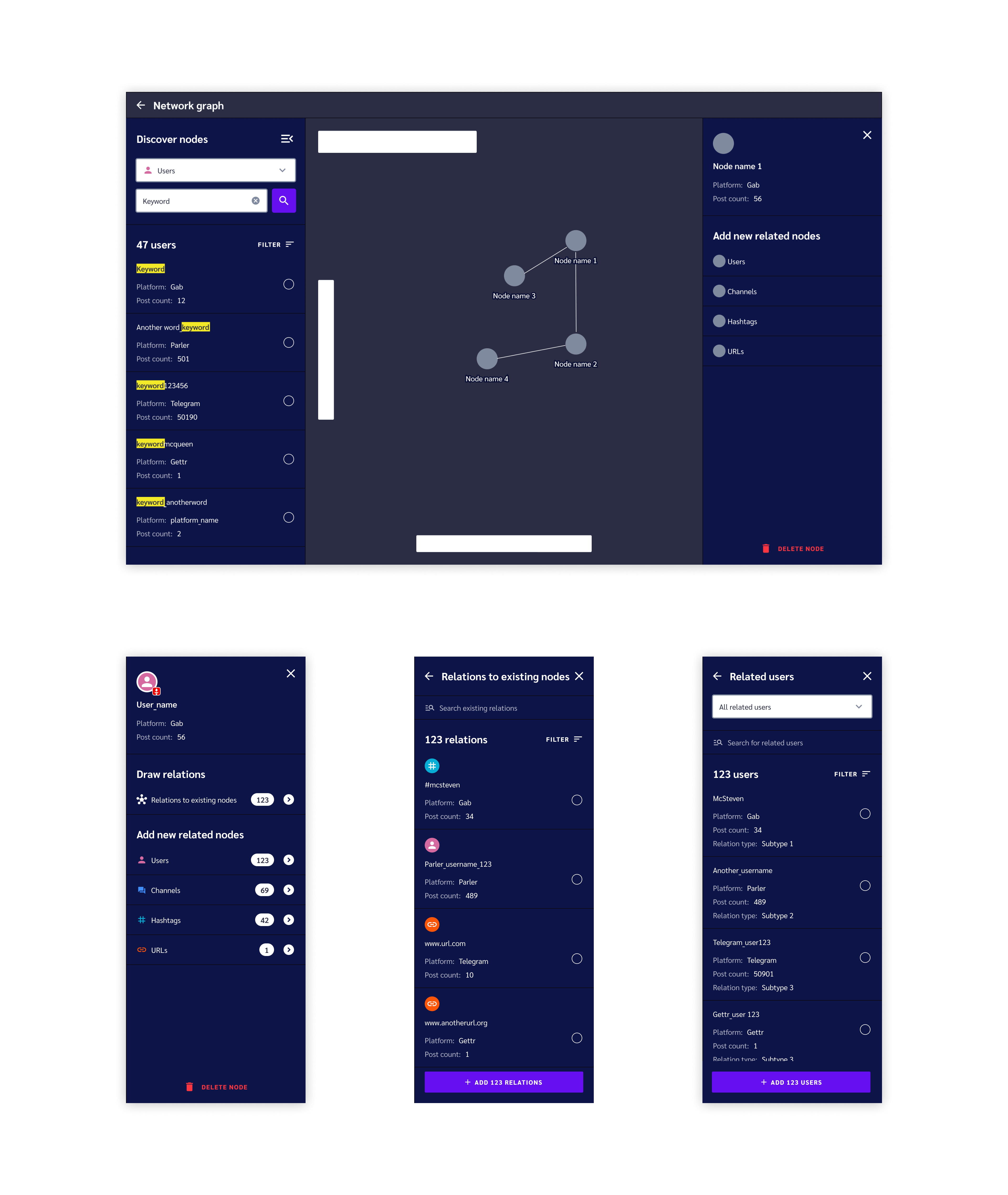
Clicking on a node reveals a right-hand panel that shows similar information to a search result, but focuses more on revealing the relationships this node has to other nodes. Users can draw new relations to existing nodes on their graph, or they can dive deep into the API and add new nodes to the graph that are related to the one in focus.
The higher fidelity screenshots below give an example of the levels a user can navigate down to find relevant nodes to add to their graph.

The Graph Experience
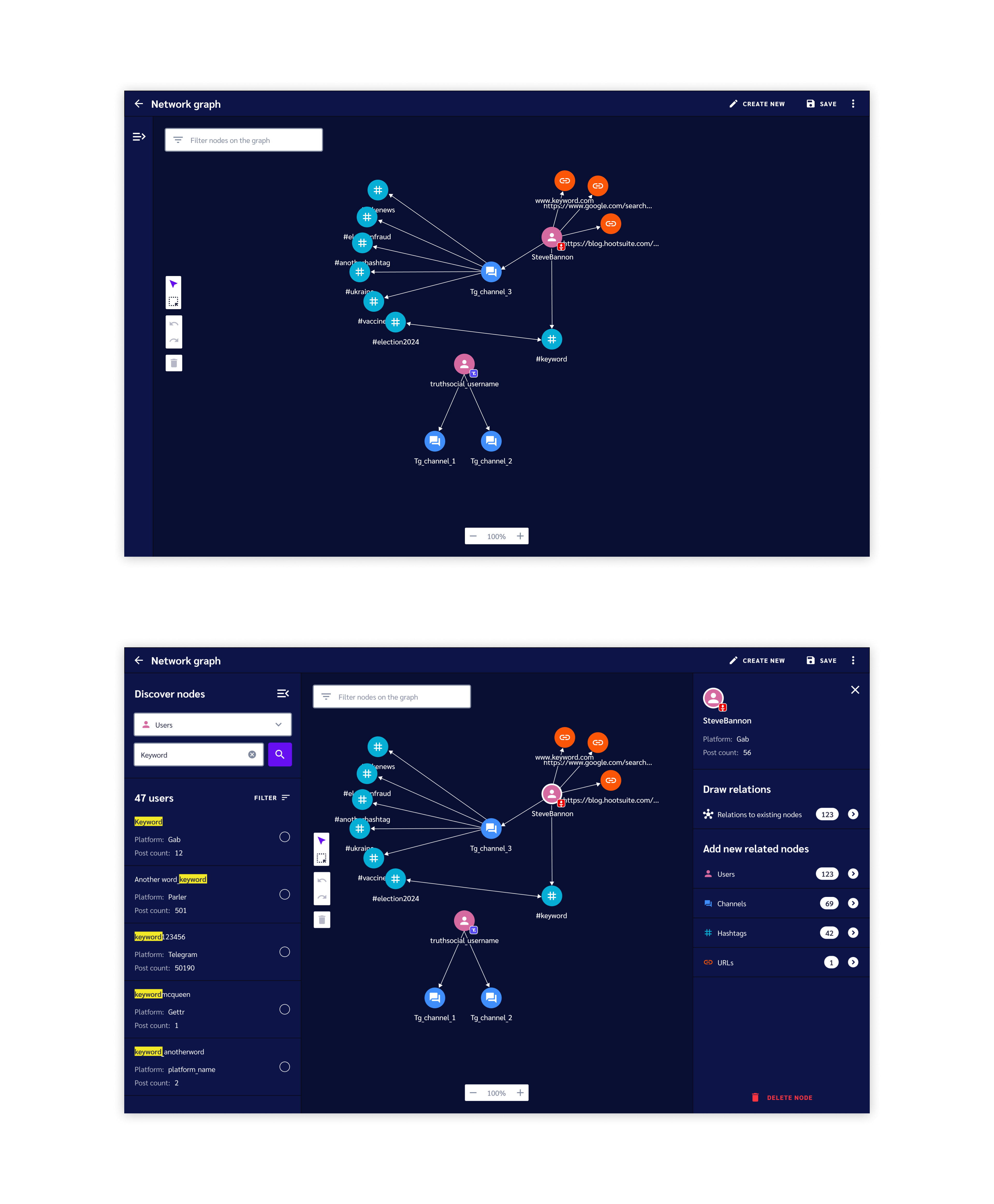
Returning to the graph interface, I started by finalizing the visuals. I created color-coded nodes, paired with icons to help users scan the graph as it grows. I also added tools for filtering and manipulating graph elements in several white boxes framing the graph.
Uni- and bi-directional arrows show how nodes relate to eachother and node titles help users identify nodes without needing to click on them.
The screenshots below show a network graph with the detail panels collapsed or expanded.

Anatomy of a Node Revisited
We started this project by gathering API data to create the archetype for each node. The screenshots below return to this and show how the API takes data from our crawlers to draw what a user would see on the graph.

Interaction demos
The last phase of the project was motion design. Here, I worked with our engineers to lo-fi prototype several ideas over multiple iterations to land on what felt the smoothest, and most intuitive.
The first video below shows what graph manipulation looks like generally. The second video shows how the graph dynamically repositions nodes as a user draws new relations.
The Results
Upon release, all our existing customers signed annual contracts to use the network graph. Those contracts brought in 200K ARR and extended our runway by 1 year.
