About Quizlet
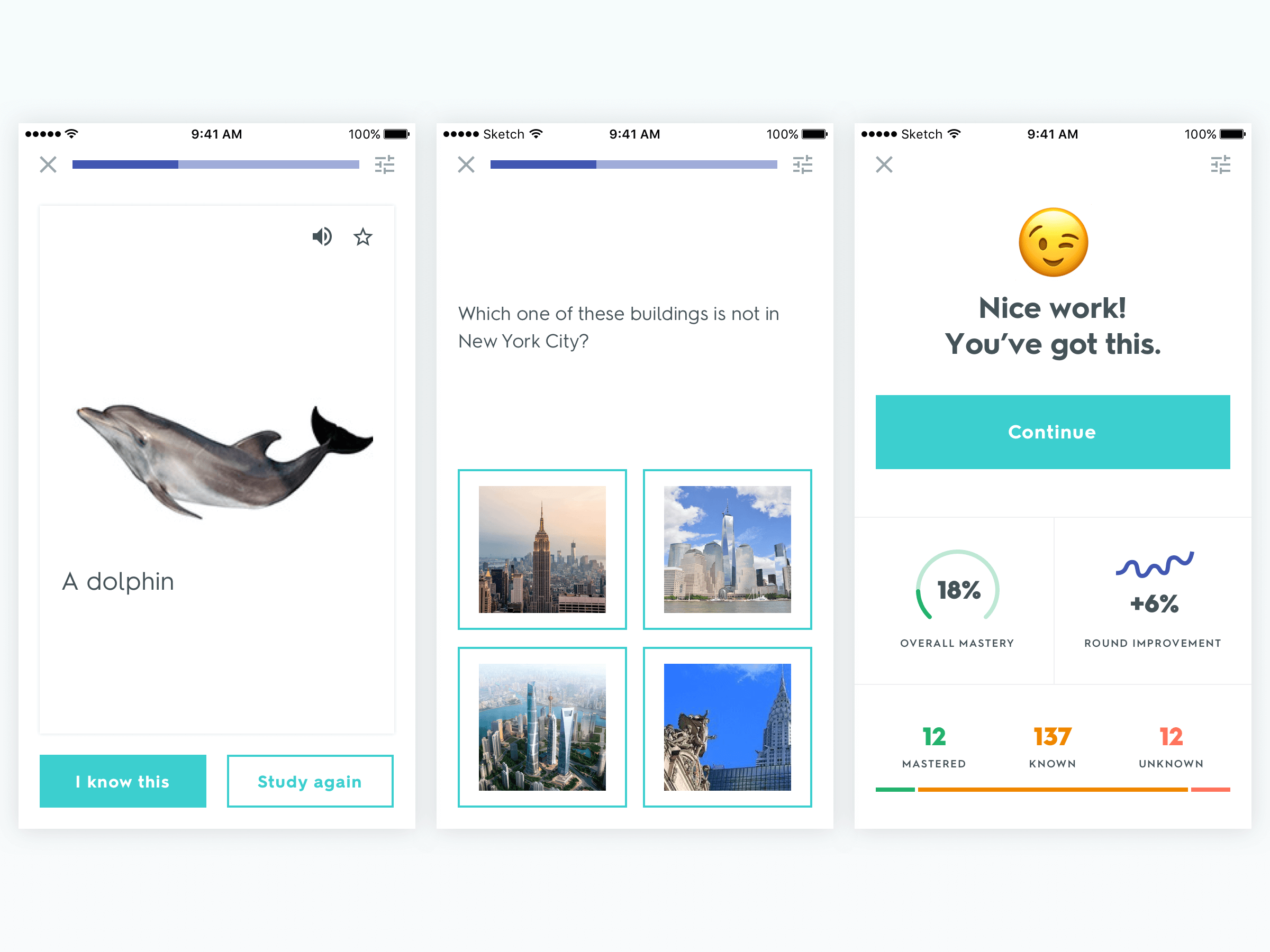
Quizlet is an online learning platform used by +50 million people every month worldwide. Generally speaking, users come to Quizlet to find something to study or create their own content.
This project tells the story of how I redesigned Create Set, our content creation tool, achieving a ~95% content publishing rate and helping our students publish over 300 million study sets.
MY ROLE
UI/UX Design, Prototyping, User Research
CROSSFUNCTIONAL PARTNERS
1 Product Manager, 3 Engineers

Why Redesign Create Set?
Content creators are the most engaged and most monetizable users on Quizlet. Thus improving the content creation experience is one of the best ways to increase the number of highly engaged, paying users.
The set creation experience suffered from high abandonment rates and several usability issues. To improve the experience, our team had 3 focus areas:
- Find ways to decrease abandoment rate by increasing set creation efficiency
- Visually redesign Create Set as part of a product wide brand and visual redesign
- Address all identified usability issues
ABOUT CONTENT CREATORS
• Most engaged user base
• Most likely to pay for features
• ~30% of total user base
• International, but most in the US

Gathering Inspiration
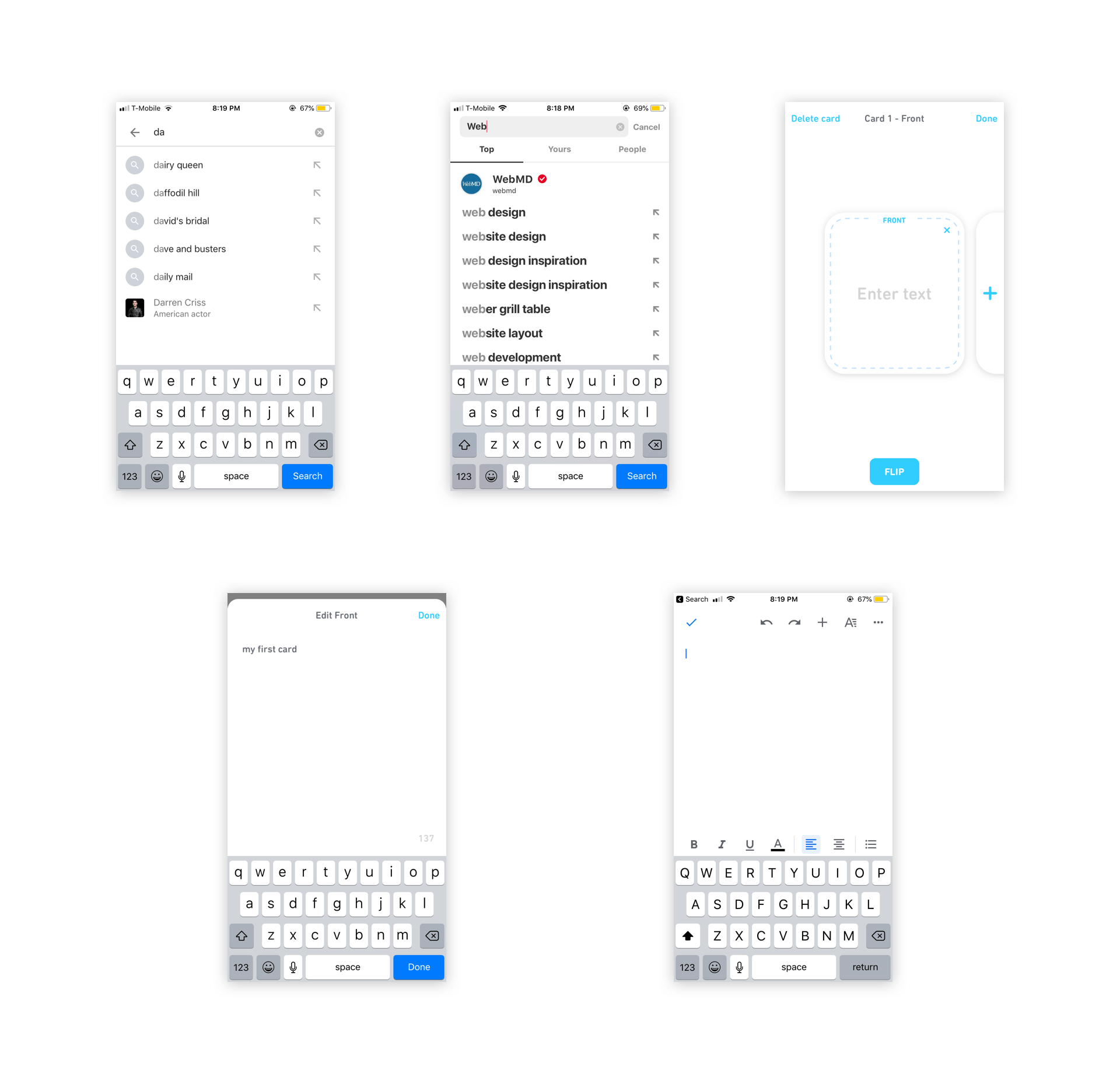
I began the design process by doing competitive research. I looked at a variety of applications and focused on how they handled the various interactions involved with making complex content, particularly on mobile. In addition, I investigated strategies other companies used to speed up content creation. Most focused on auto-completing and or suggested content for users to fill in so they don't have to waste as much time typing things out.
After gathering some inspiration, I used whatever I thought could apply to Quizlet and started exploring some concepts.

Wireframe Concepts
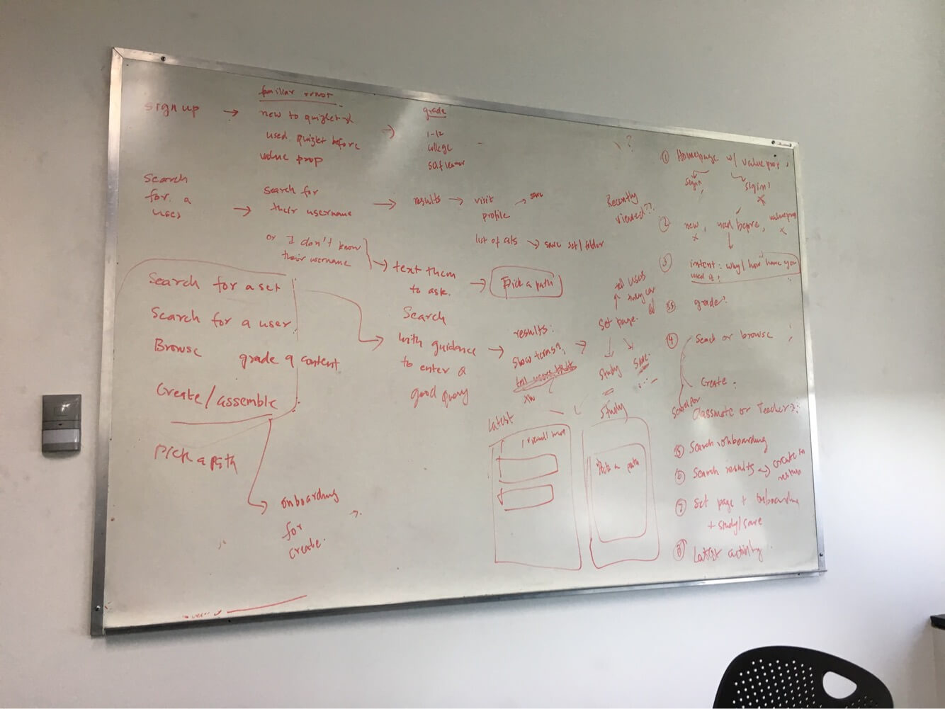
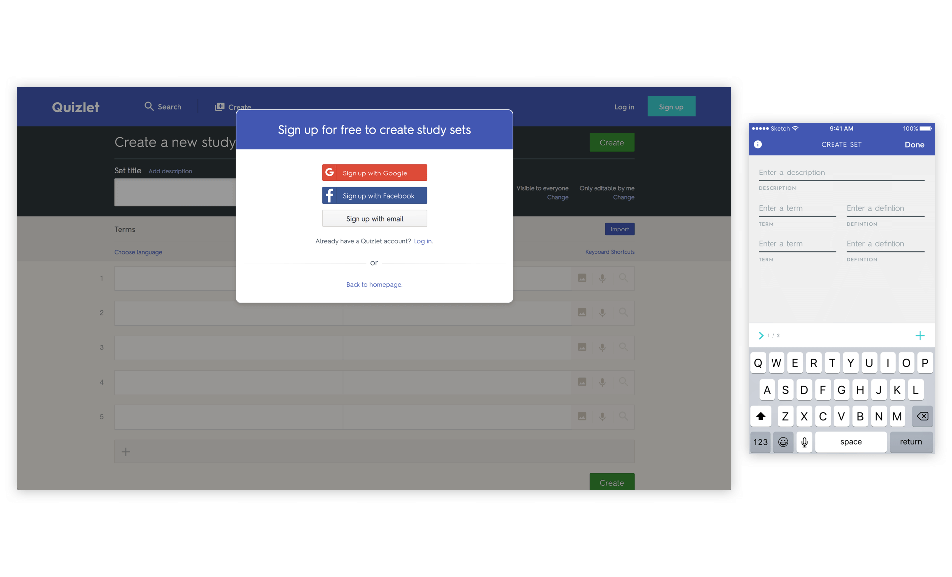
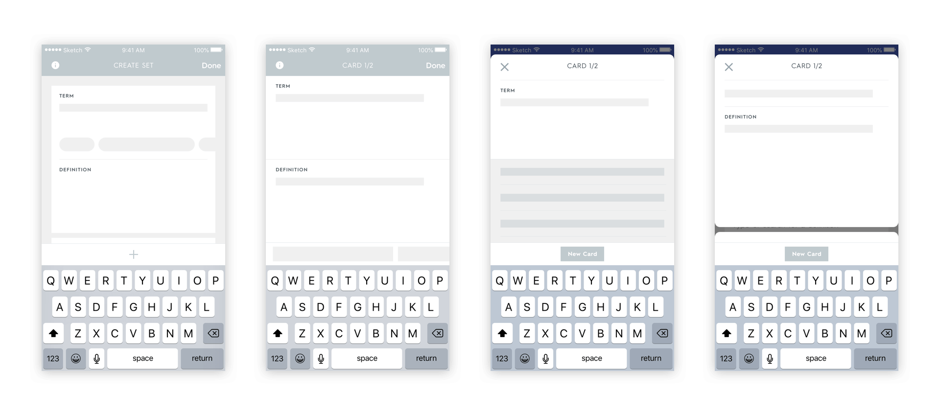
The previous Create Set designs on mobile didn't have much form or taxonomy. As part of wireframing, I wanted to clearly differentiate what parts of the screen are devoted to content creation, where associated actions and tools are located, and make room for paid features from web that didn't reach parity. I also explored ideas for auto-suggestions.
The wireframes initially focused on immersive, full-screen creation to give users flexibility and make room for tools and auto-suggestions. Our data however, showed that longer form content creation was a minority use case so I was able to focus on lighter, more scroll friendly concepts.

Higher Fidelity Explorations
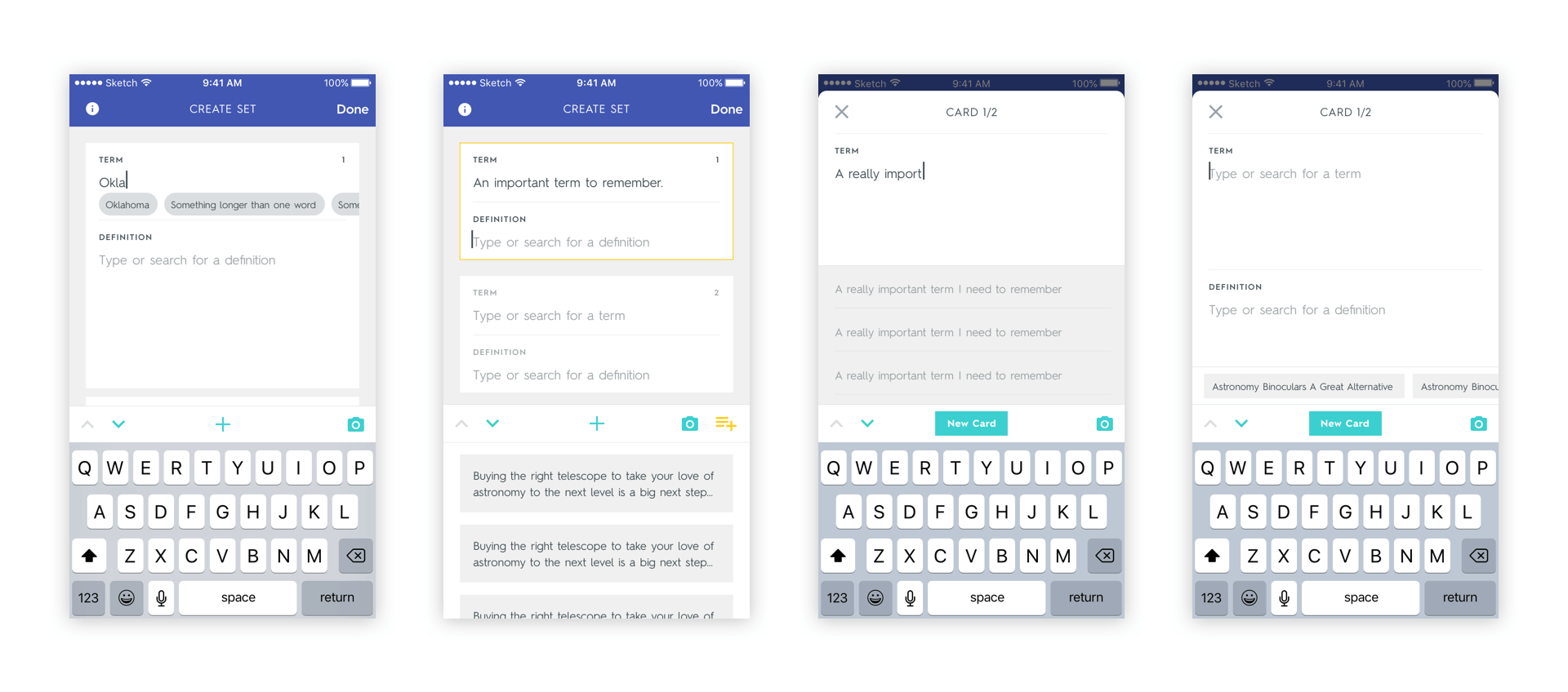
Before picking a path forward, I explored some of the concepts in higher fidelity to get a better feel for which ones would perform the best. It was at this stage, again with the help of data, that I was able to eliminate the full-screen creation concepts and focus on the scrollable feed style concepts.
The scrollable feed style concepts would allow for a light weight content creation experience where users could quickly create cards, edit them, and jump between them with significantly fewer clicks than any full-screen experience. The only things I had left to figure out were final touches on the actions in the toolbar and a fully fleshed out version of auto-suggestions that could work within smaller cards.

High Fidelity Designs
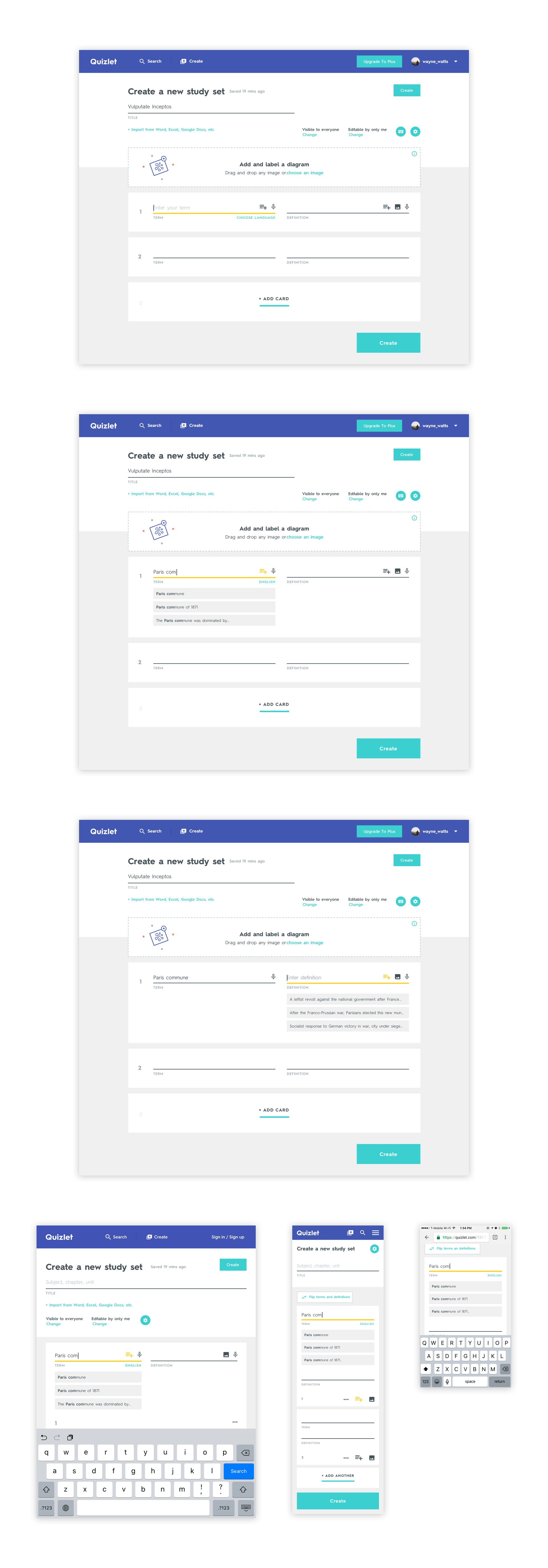
In the final designs I fleshed out the scrollable feed concept. I gave structure to the page by having a clear foreground and background, incorpating useful information into a header, and enclosing term and definition fields into clearly tappable cards. Lastly, I enclosed all relevant tools and actions, like adding a card, field navigation, and image uploading, into a toolbar that fits right above the keyboard.
From there, I fit the auto-suggested content right beneath the form fields they apply to. The auto-suggestions character match as users type and provide a one-click delete state so users can preview as many as they need.
The last finishing touch was animations to make this experience fluid and allow users to switch between cards and create them with ease.


Translating To Responsive Web
We launched the Create Set redesign on iOS first to fantastic results. Our content creation abandonment rate was virtually eliminated, with over 90% of users publishing sets they started. Given this success, our next step was to adapt these designs to responsive web.
The biggest challenge here was around layout flexibility. I reskinned the web experience to make sure the branding and visuals were matched and from there focused on how cards would grow/shrink as the screen size changed.
At desktop and tablet sizes, the page has a two-up layout where form fields exist side by side and their corresponding actions fit within the field itself. Auto-suggestions once again appear right below the fields they apply to. As the screen approaches mobile sizes, I designed an experience similar to iOS except that the toolbar from the previous design fits neatly into the cards themselves.

The Results
After releasing the Create Set redesign product wide, we virtually eliminated content creation drop-off rates. Today, ~95% of users who start creating a set finish it across devices. In addition to reducing abandonment, porting image upload to mobile greatly increased subscription conversion rates. Image upload on mobile remains our highest converting subscription flow across platform.
To date, Quizlet users have used Create Set to publish over 300 million study sets.
